Fairway Market - The Fairway Collection
Whispering to be heard—a grocery’s private label finds sophistication in simplicity.
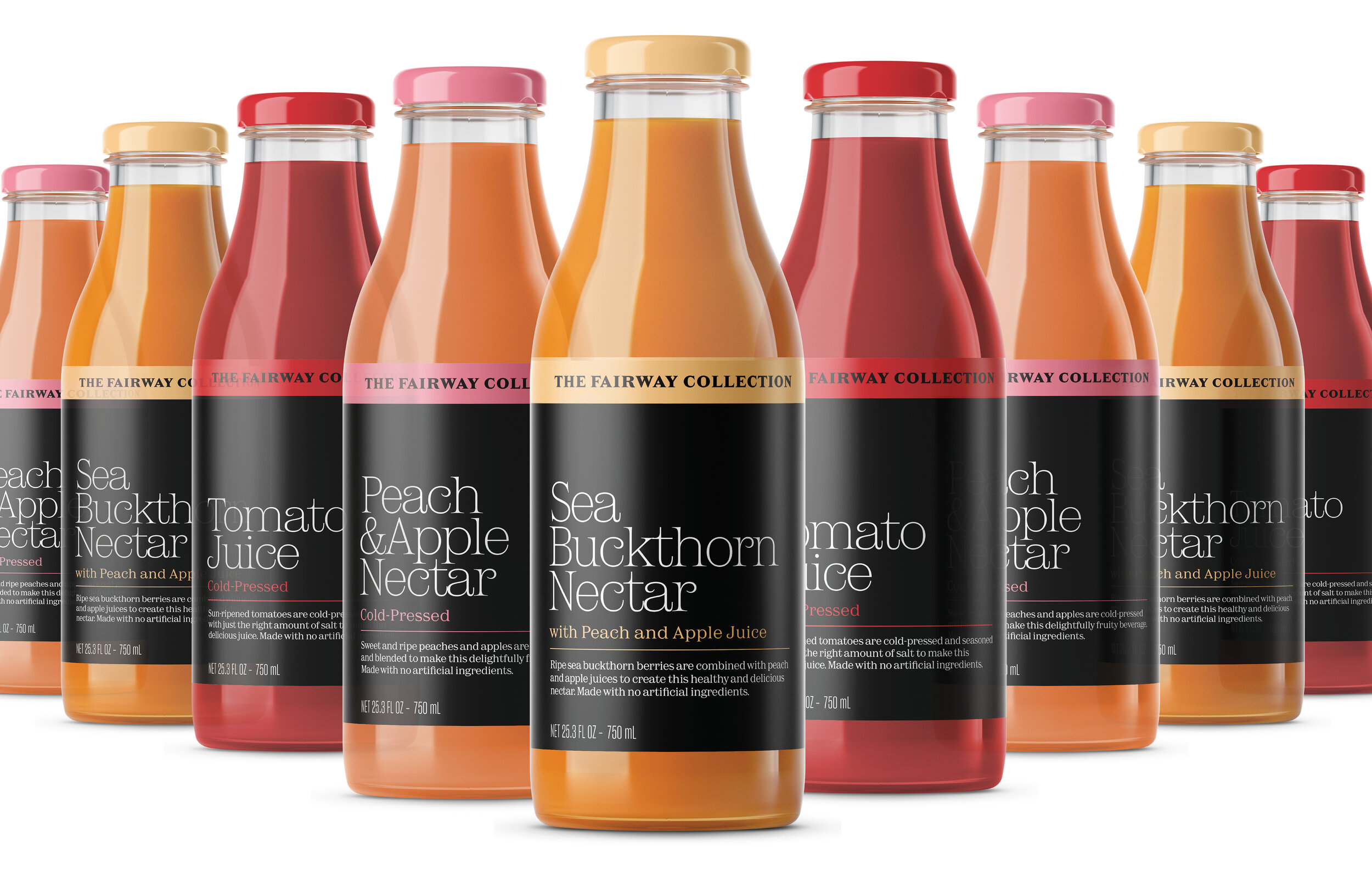
How does an independent regional market position its in-house label to compete with well-established national brands? By rethinking dated notions about product display with straightforward design solutions that engage distracted shoppers. New York’s iconic regional market asked us to rebrand their basic and premium product lines to give them consistency, shelf appeal, and most importantly, a point of view.
With this curated line of premium products, we used a minimalist but warm approach. A striking black color palette and distinctive typeface transform the packaging into an oasis of quiet sophistication on the shelf.
The redesign gave Fairway a shelf presence strong enough to compete with deep-pocketed national brands, even without advertising or marketing support. And with select products leading sales within their category, it proves that smart design can add measurable value the bottom line.