Fairway Essentials
Smart packaging design transforms everyday goods into a supermarket’s bread and butter
How does an independent regional market position its in-house label to compete with well-established national brands? By rethinking dated notions about product display with straightforward design solutions that engage distracted shoppers. New York’s iconic regional market asked us to rebrand their basic and premium product lines to give them consistency, shelf appeal, and most importantly, a point of view.
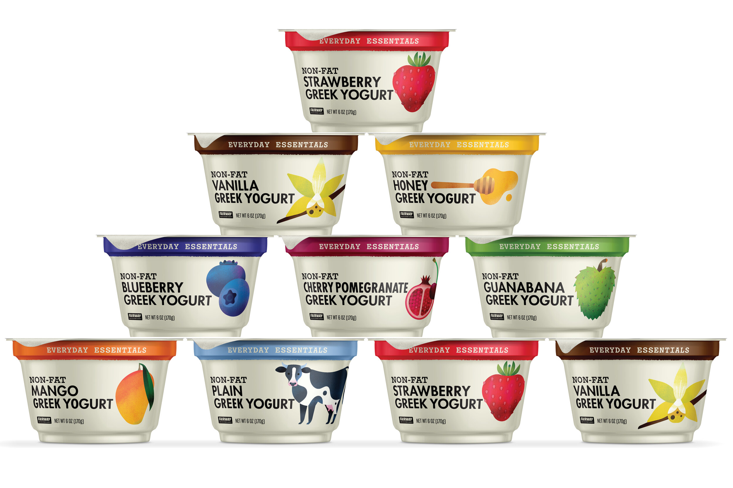
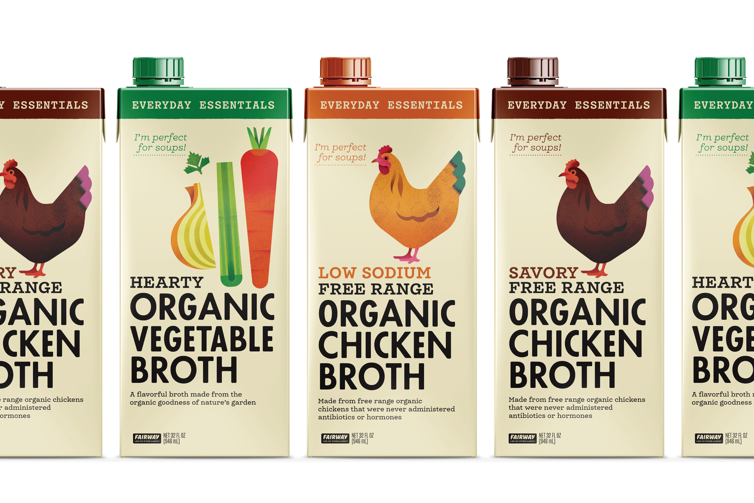
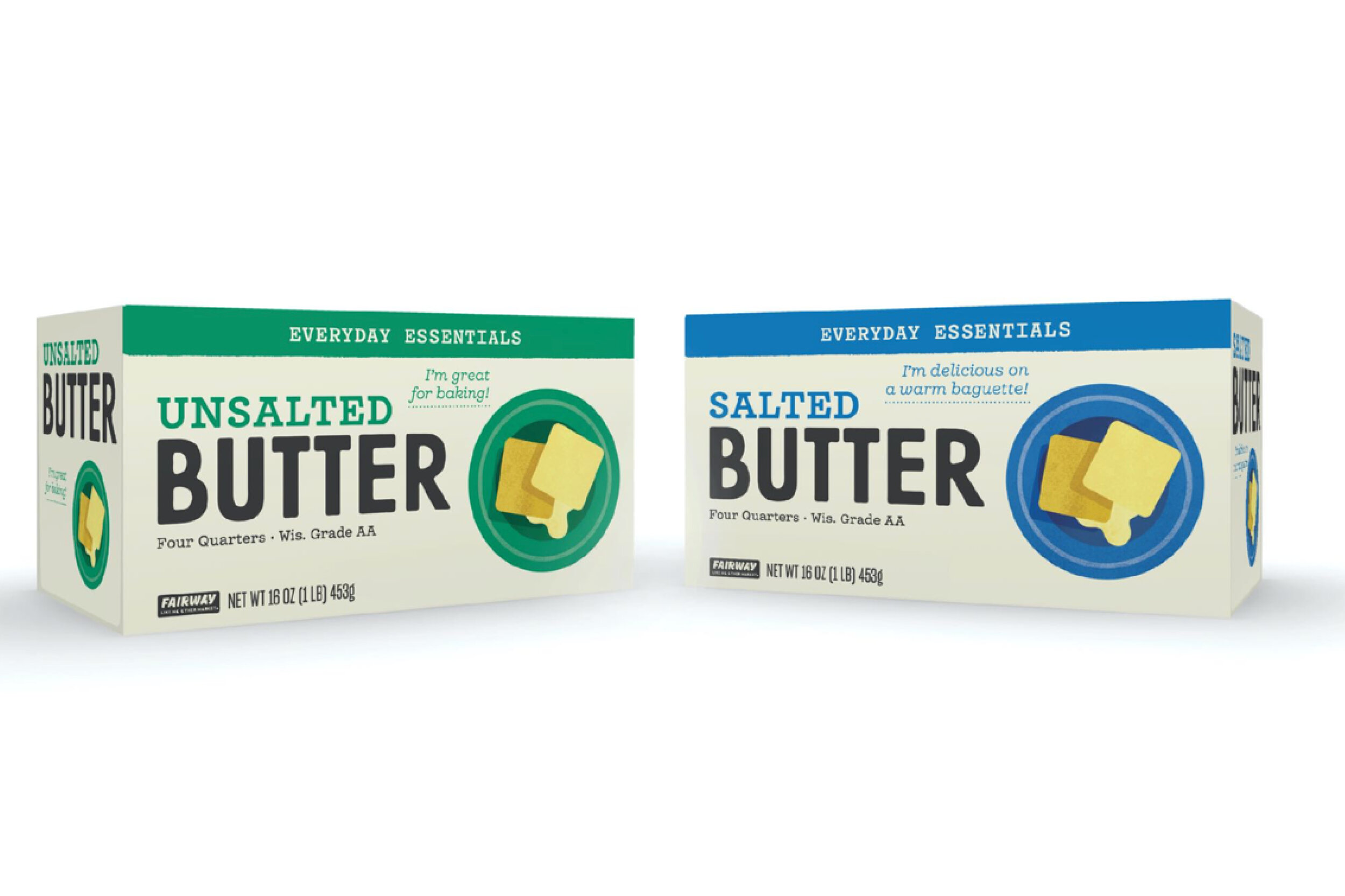
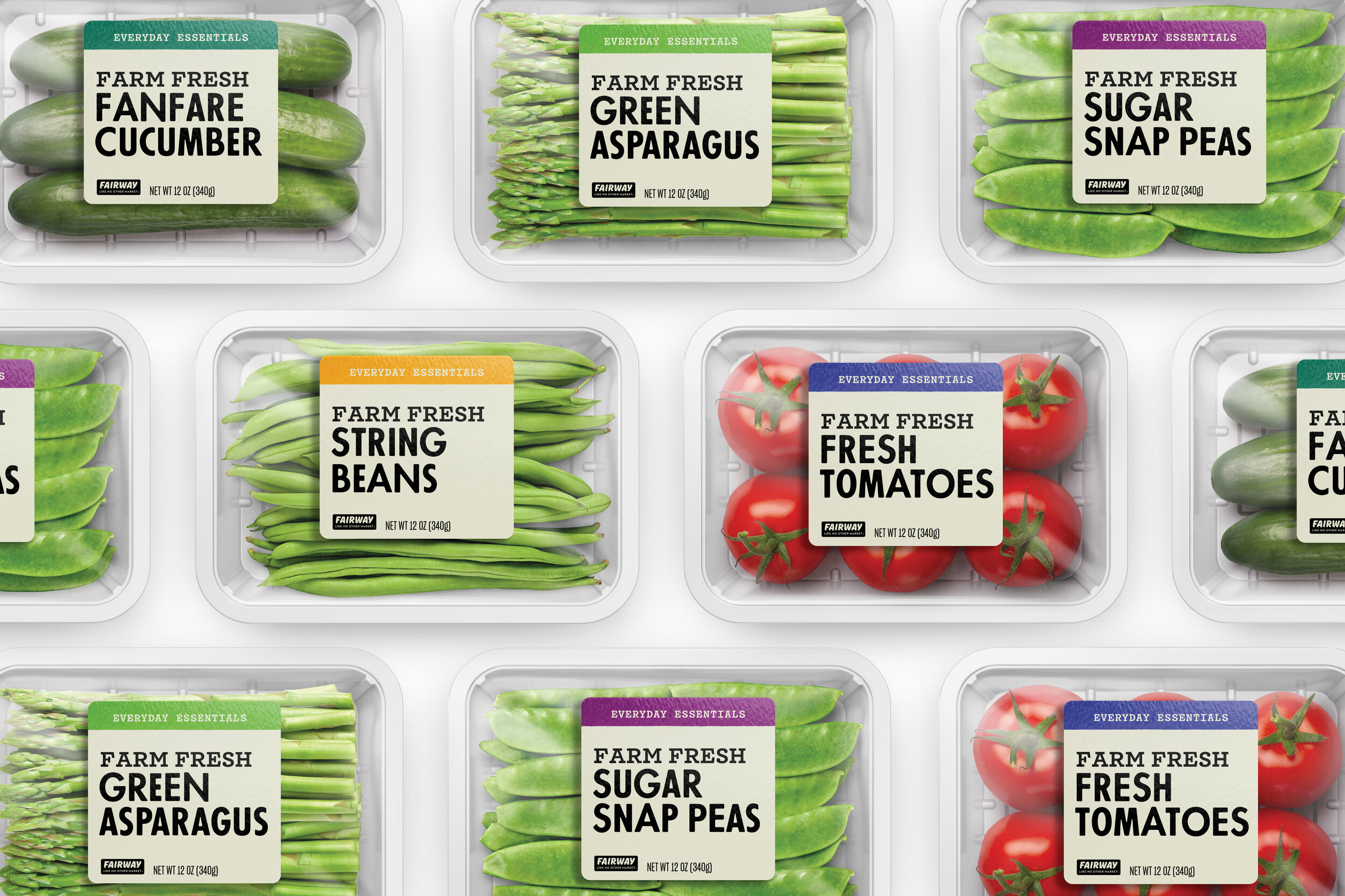
Fairway Essentials carries the items we use everyday, from butter to milk to beans. The simplicity of the system, with bold type, a strong product focus, and a distinctive illustration style give it a no-nonsense approachability.
The redesign gave Fairway a shelf presence strong enough to compete with deep-pocketed national brands, even without advertising or marketing support. And with select products leading sales within their category, it proves that smart design can add measurable value to a company’s bottom line.