
Glyphs 3.0
Designing the identity and the site for the software used for designing the custom fonts of Volvo, Saab, Toyota, Volkswagen, Seat, Sephora, Apple, Google… aaand, well, practically everybody.
Glyphs App is a Mac font editing software created by type designers and software developers Georg Seifert and Rainer Erich Scheichelbauer. For the 2020 launch of their highly anticipated Glyphs 3, they were looking to relaunch their website and brand identity to better communicate what Glyphs does and bring new energy to the release.
The new website simplifies the architecture for ease of navigation, enhancing access to tutorials and resources and showcasing type designers’ projects in a dynamic way. It uses a single variable font by ABC Dinamo, drawn and developed entirely within Glyphs.
The logo and identity simplify and reimagine the app, bringing the focus to the content itself: the typographic expression made possible with Glyphs.
Designed by Matteo Bologna (yes, CEOs do freelance work for friends) in partnership with his super talented designer/friend Andrea Trabucco-Campos.
Chris Corby developed the site.


A tool for the community
Glyphs is one of the go-to tools for type design because it’s built for everyone—novices and professionals alike. The website has been re-imagined as a tool for the community. It not only showcases the app, but provides a window into type designers’ work.
The community superpowers Glyphs by constantly referencing tutorials as a resource for learning, and joining the Forum to exchange ideas with the makers of the app and other members. Some of the world’s most renowned foundries use it, and emerging talent engages with it on a weekly basis.
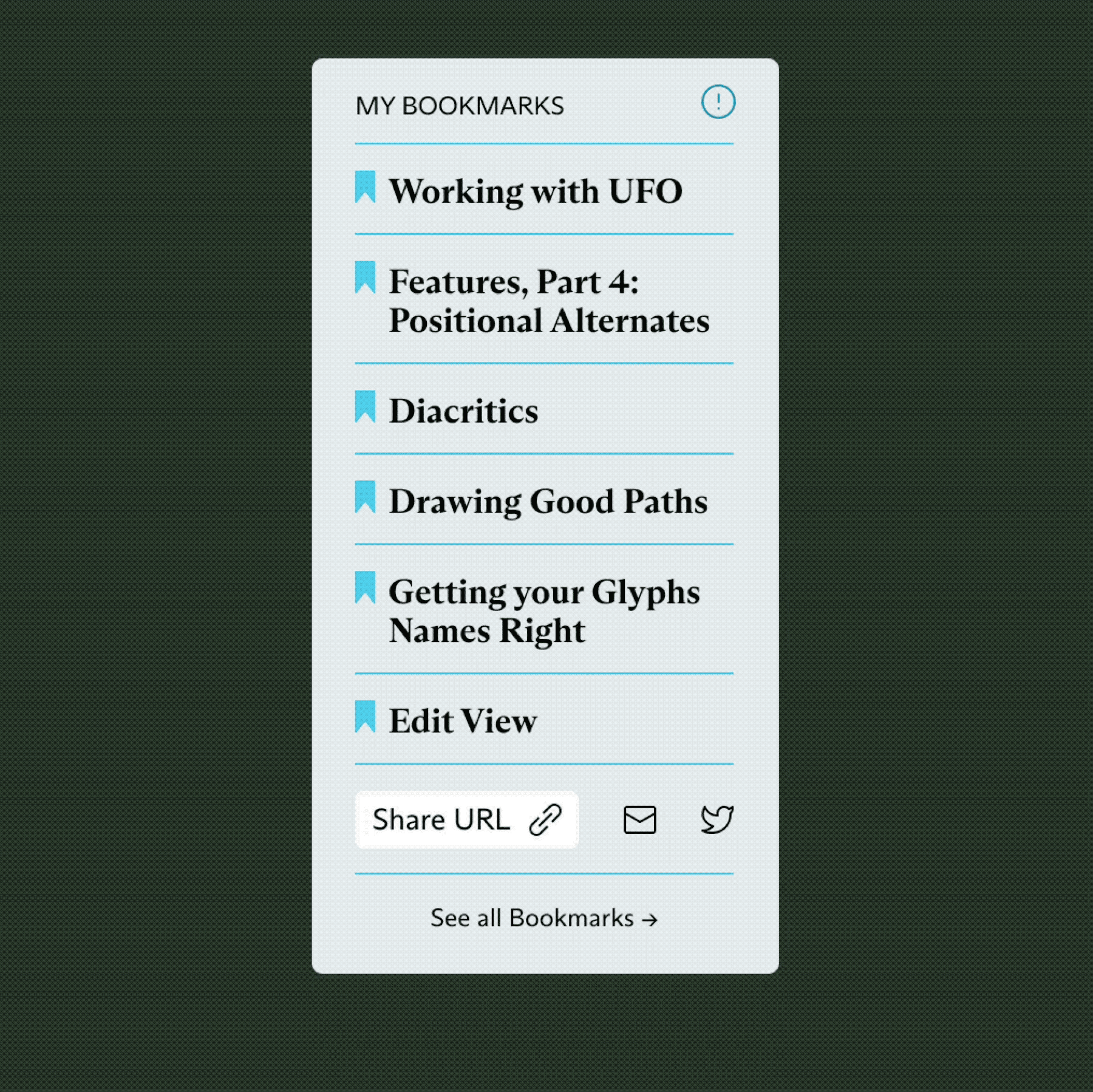
Finding and discovering new tutorials quickly is at the core of the new experience. The Learn section offers bookmarks for creating personal lists and recommendations from experts on topics ranging from essentials to coding.


One font can do it all
The website is typeset using ABC Arizona, an unreleased variable font drawn by Elias Hanzer for ABC Dinamo made entirely within Glyphs.
The typeface covers a wide typographic range that spans from sans to serif, making it versatile for any context.
By shifting weights it can create hierarchy across content, optimal readability in long text blocks, and visually impactful typographic moments.

Clarity of app features
We designed and art directed abstractions of the Glyphs app environment that were animated by the talented Abel Martins—a new form of community engagement for Glyphs.


A new chapter
The new logo and design system signal a new chapter for Glyphs. The iconic, simplified mark connects with the modular language at play in the rest of the identity.
The Glyphs 3 symbol contains the building blocks that make the rest of the app suite visually cohesive: Glyphs 3 Mini and all of the Pro font tools, which will be gradually released in 2021.
The color palette builds on the heritage green that distinguished Glyphs from its competitors, evolving it to a more vibrant, dynamic and ownable green. The extended palette uses a combination of brights and darks that allow flexibility within the site and social media.


